Accessibility at RetailMeNot

Timeline
November 2018 - March 2019
Role
Designer
Team
Jennifer Haddad, Ryan Ambler
Tools
Sketch
Overview
One of the six RMN core values is Diverse and Inclusive. When we think about how to be diverse and inclusive across our breadth of products, nothing embodies this more than making accessibility a priority. Pioneered by a few designers and myself, we put together a cross-functional team to work on improving our core products to be more inclusive and accessible. This began with overhauling our color palette.
Color audit
| Element | Ratio (AA) |
|---|---|
| Text ≤16 | 4.5:1 |
| Text ≤18 | 3:1 |
| UI components | 3:1 |
In June 2018, WCAG released their 2.1 guidelines that included new contrast ratios for UI components.
There were areas of our color palette, such as our core brand colors, that passed contrast ratios with flying colors.
Our UI colors, however, didn’t do as well. The biggest errors we found were our colors used for primary CTA’s, text links, validation, and text.
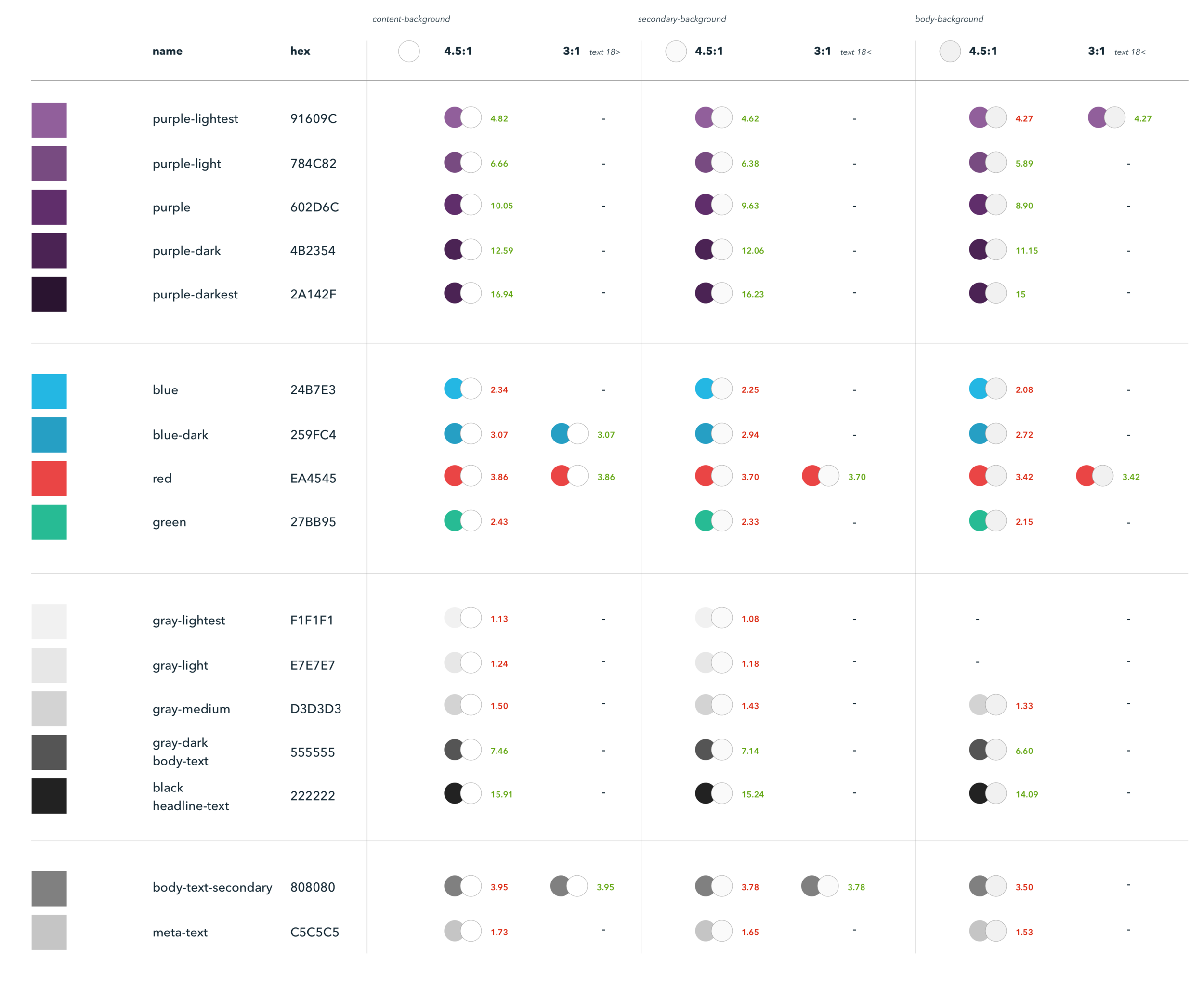
Color audit of our existing color palette, comparing contrast ratios
Color studies
Buttons + links
We looked for blues with a similar hue but tweaked the brightness and saturation to achieve a higher contrast.


Iconography
Offer Cards

Our Offer Cards that are shown on RMN Store Pages are a unique use case, because they contain an “anchor” (20% OFF) that ranges in size, and an “Offer type label” (In-Store Coupon) that is consistently 14px. These two parts of the Offer Card component are the same color, but had different success criteria for color contrast (4.5:1 ratio vs. 3:1). While iterating on our palette, we found colors that worked for our Offer type label were too bland to be used for the anchors. We wanted to keep the vibrancy that the anchors brought to the Offer Cards.
To solve this problem, we decided to create a light and dark version of each swatch. We felt this gave our Offer Cards both a variety in type hierarchy and visual boldness, and ultimately would enable designers to scale this palette across our UI as it’s rolled out.

Typography + backgrounds
We wanted our neutral palette to be a subtle blend of grays that could be used across background colors and typographic treatments.

A/B testing

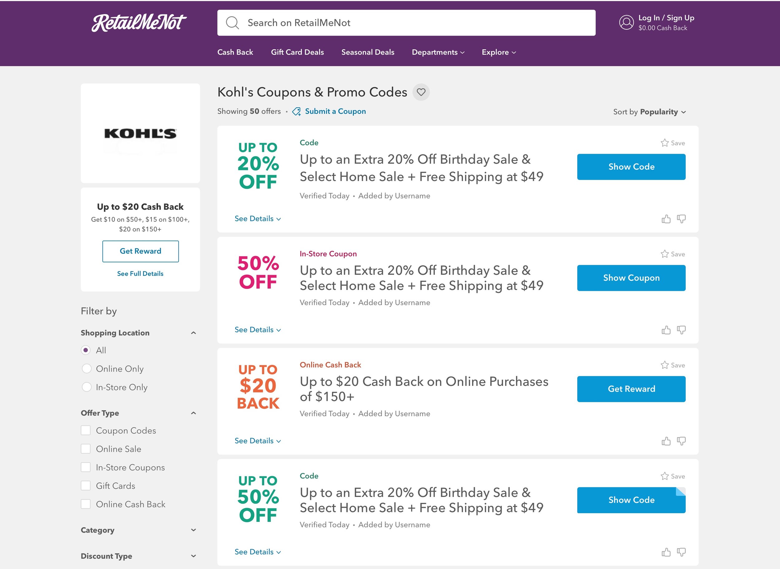
current RetailMeNot.com Store Page
After arriving on a new set of colors, our first step was to implement our new CTA color - which had the most visual weight through our UI. 70% of all traffic through retailmenot.com is funneled through the Store Page. In order to make such a monumental change to our UI, we first needed to run an A/B test to see the affect this change may have on yield.
A/B Testing through Optimizely
Purpose: Quantify the impact of altering the variance of blue in offer CTA
Hypothesis: Changing variance of blue in offer CTA will not negatively impact performance.
Platform: Desktop & mobile
Traffic: 5% traffic per slice
Dates: 11/9/2018 - 11/16/2018
What we tested


Results
what we measured
Bounce rate: percentage of users who navigated away from the RMN Store Page after viewing only one page.
Conversion: percentage of users who completed a desired action on the RMN Store Page, such as clicking on an Offer Card and using a promo code.
Yield: percentage of overall usage
After one week of running the test, sitewide impact was generally positive. On Desktop, Slice A saw a higher percentage of Bounce rate, Conversion, and Yield when compared to Slice B. Slice A was also consistently higher in yield by browser type, while Slice B saw diversion in direction. Detailed breakdown of the stats can be found below.


“Outcome: Roll with Slice A”
Implementation
Coordinating efforts across RMN
Roux is RMN’s shared library, containing colors, icons, and a few components. Many, but not all Engineering squads across RMN are inheriting changes whenever Roux is updated. The challenge was a) coordinating efforts and b) finding areas where inconsistencies lie and updating those hard-coded values to the Roux variables. This was a cross-functional effort across PM and multiple Eng squads. We needed these changes to be somewhat aligned, so we didn’t have large scale color inconsistencies across the platform.
The process was as follows:
Roux base-styles is updated to version 3.1.0, Roux common-ingredients is updated to version 12.28.0
Squads inheriting changes from Roux update to the latest version
Color variables using Roux should be updated automatically with the new dependency
Inconsistencies indicate hard-coded colors that need to be swapped to match Roux variables

OLD vs. new color palette

Buttons + icons

Anchors, meta text, & links

Inputs, checkboxes, & radio buttons

Error + success states

Going forward
Updating our color palette is just the first step in our goal towards making a more inclusive and accessible product.
The accessibility group will continue to meet and work with our cross functional partners to implement positive changes.
Education around a11y
A huge part of implementing change across an organization involves education around what, why, and how.
Using the RMN Wiki, I put together an “Accessibility basics” area, which outlines the very basic standards for making an experience accessible and inclusive.


What better way to educate people about alt text than through the use of a cute puppy.
Accessibility charter
As we begin to roll out accessibility changes across our products, we realized there was a need for an agreed upon set of standards to share out amongst the larger organization. This goal of the charter would be to outline accessibility best practices and the guidelines we aspire to achieve through designing and building our products.
The Accessibility Charter outlines:
What are RMN's agreed upon and enforced accessibility standards?
How is the design team working towards (a) ensuring new designs meet standards and (b) how existing designs in the wild need to be updated?
How Product and Engineering can partner to move along 1 & 2 (with relative priority)?
Our goal is to reference this document as we QA new and existing designs and development.
